Background
Auction Technology Group (ATG) is a leading provider of online auction marketplaces and technology solutions. ATG owns and operates several prominent marketplaces, including Proxibid, which connects buyers and sellers across various asset categories, and BidSpotter, a platform for industrial and commercial auctions.
These marketplaces offer comprehensive tools for auction management, marketing, and data analytics, enhancing the auction experience for both auctioneers and bidders. By leveraging advanced technology, ATG ensures efficient, accessible, and engaging auction events that maximize participation and revenue.
Context
Proxibid is an online marketplace that facilitates live and timed bidding on a wide range of items, including but not limited to heavy equipment, industrial machinery, classic cars, antiques, collectibles, and more. The platform acts as an intermediary, connecting buyers and sellers in a virtual auction environment.
Proxibid provides a secure and transparent bidding process, enabling users from around the world to participate in auctions in real time. The platform often hosts auctions conducted by various auction houses, sellers, and dealers. Participants can place bids, monitor auctions, and, if successful, purchase items through the online platform.
Unlocking Visibility: Through Overhauling the navigation
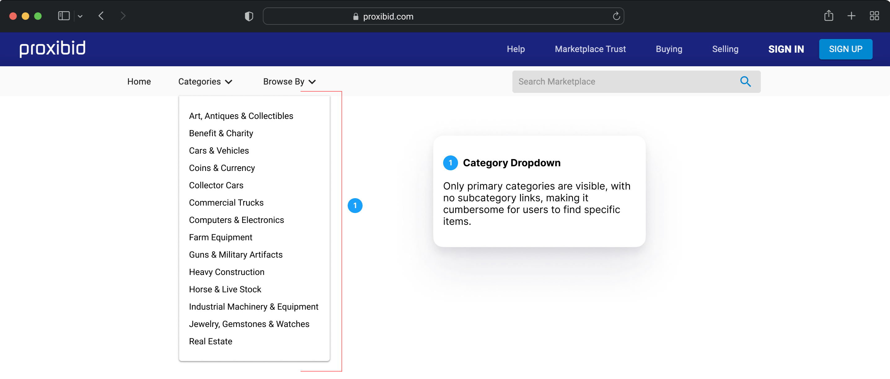
When we embarked on the ambitious redesign of the Proxibid website, we uncovered a silent yet powerful roadblock—one that was quietly limiting both search engine visibility and user experience: the navigation system.
At first glance, the site’s primary and mega navigation seemed functional, but beneath the surface, a critical flaw became evident. The absence of subcategory links wasn’t just a minor inconvenience—it was actively preventing pages from being indexed and ranked by search engines. This meant that even the most valuable auction listings remained invisible to potential buyers searching online. Without a clear path for search engines to follow, Proxibid’s pages were slipping into digital obscurity, dramatically reducing organic traffic and discoverability.
The Hidden UX Roadblock
Beyond SEO, this navigation gap was also creating friction for users. Shoppers came to Proxibid with the intent—to find rare collectibles, industrial equipment, or unique auctions. But instead of a seamless experience, they faced a maze-like structure that forced them to dig through broad categories, wasting valuable time and often leading to frustration or abandoned searches.
By addressing this challenge head-on, we weren’t just improving navigation—we were unlocking untapped visibility, discoverability, and efficiency, ensuring that both search engines and users could seamlessly find what they were looking for.
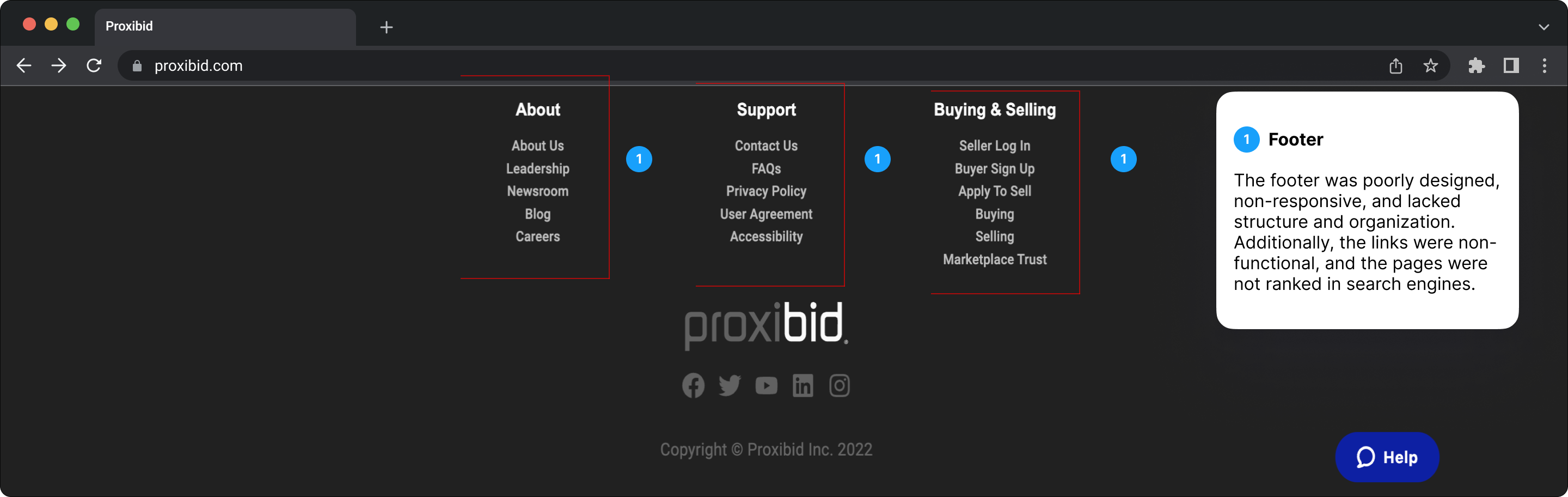
Seamless Navigation: Elevating the footer for a unifed experience
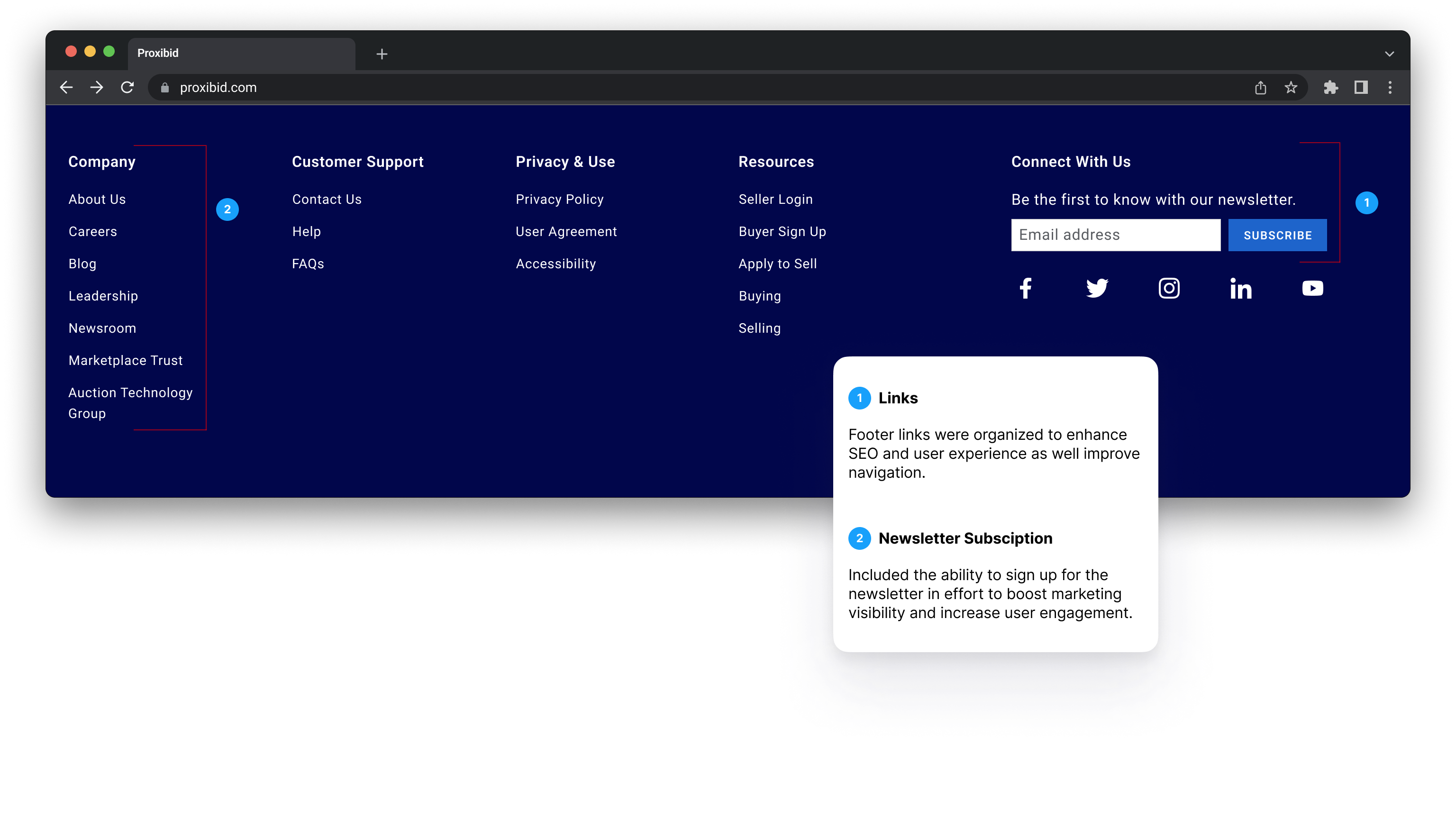
As we tackled the redesign of Proxibid’s primary navigation, it became clear that the footer couldn’t be an afterthought—it was a crucial piece of the puzzle. More than just a resting place for links, the footer serves as a secondary navigation hub, guiding users who scroll to the bottom in search of key pages, support, and additional resources.
By redesigning both the primary navigation and the footer together, we ensured a cohesive, intuitive experience across the site. This alignment wasn’t just about aesthetics—it was a strategic move to enhance usability, accessibility, and SEO. A well-structured footer reinforces navigation pathways, boosting search engine rankings by providing crawlers with additional internal links while offering users a familiar and efficient way to explore the site.
This holistic approach transformed the footer from an afterthought into a powerful tool—bridging the gap between user needs, engagement, and discoverability.
Bridging bussiness goals and user needs
At the core of our navigation redesign was a dual mission: to enhance search engine performance while simultaneously improving user experience. These two objectives weren’t just complementary—they were inseparable.
From a business perspective, the key challenge was ensuring that search engines could efficiently crawl and index Proxibid’s vast inventory. The solution? Establishing deep links that connected all primary and top-level subcategory pages, reducing crawl depth and making it easier for search engines to surface the right content. This structural refinement was essential in boosting rankings and increasing organic traffic.
For users, the goal was equally clear: simplify the journey. Shoppers needed a fast, intuitive way to navigate through categories and subcategories without unnecessary friction. By streamlining the navigation system, we not only aligned with SEO best practices but also created a smoother, more efficient browsing experience—one where users could seamlessly find what they were looking for, without frustration or dead ends.
This strategic alignment between business and user needs ensured that the redesign didn’t just look good—it performed, driving both visibility and engagement in a meaningful way.
Crafting a navigation strategy rooted in research
To build a navigation system that was both user-friendly and SEO-optimized, I turned to a deep competitive analysis of industry leaders like Target, eBay, Home Depot, Ritchie Bros., and Craftsman. These brands have spent years refining their navigation structures to drive engagement, conversions, and discoverability—offering invaluable lessons on what works and what doesn’t.
Beyond competitor insights, I also delved into research-backed best practices from renowned sources like the Baymard Institute and Nielsen Norman Group, ensuring that every decision was informed by data and usability principles rather than assumptions.
Armed with these insights, I iterated through multiple navigation models, testing and refining until I identified a solution that would not only enhance SEO visibility but also create a seamless, intuitive user experience—bridging the gap between business goals and user needs.


Concept Iterations


Solution
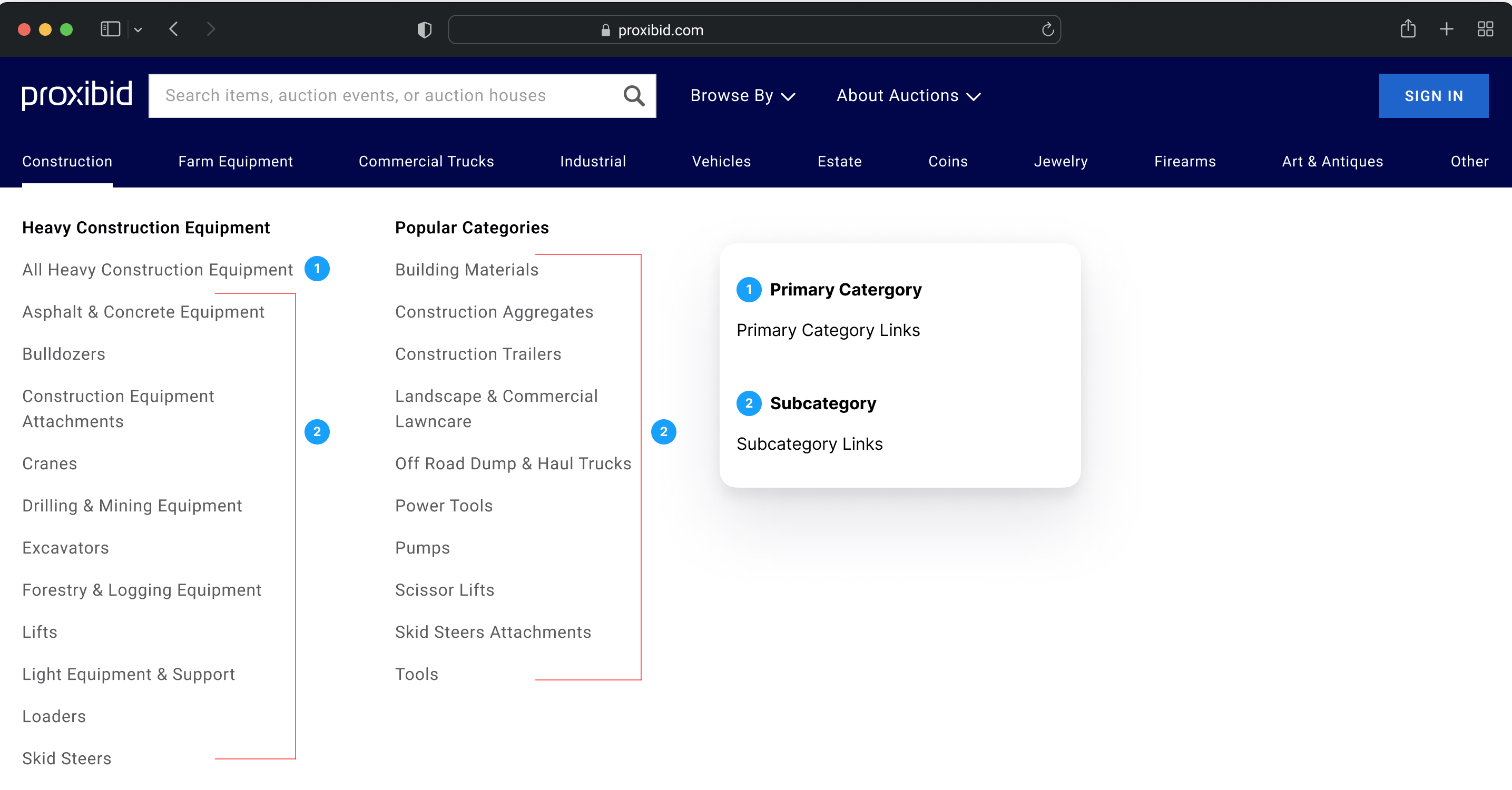
To tackle the SEO and usability challenges in the Proxibid redesign, I proposed a strategic shift—implementing an exposed navigation system. This approach wasn’t just about aesthetics; it was about unlocking discoverability. By integrating direct links to category and subcategory pages within the mega navigation, we created a seamless bridge between user intent and content accessibility.
From an SEO perspective, this change was a game-changer. With Google’s crawlers now able to index a far greater number of category and subcategory pages, keyword rankings would see a significant lift, improving organic visibility across the site. But the impact wasn’t just behind the scenes—for users, the journey became dramatically smoother. By exposing subcategory links upfront, we eliminated unnecessary clicks, ensuring that shoppers could navigate directly to their desired listings with minimal effort.
Perhaps the most striking transformation? The navigation structure expanded from just 16 category links to over 160, increasing category exposure tenfold. This shift provided users with a clearer, faster path to relevant content, reinforcing engagement, efficiency, and conversion potential—a navigation strategy built not just for today, but for sustained growth.
From hidden to found: how a smarter navigation transform proxibid
The shift to an exposed navigation system wasn’t just a design upgrade—it was a visibility breakthrough. By strategically integrating direct links to category and subcategory pages within the mega navigation, we didn’t just improve the user experience—we unlocked record-breaking SEO performance.
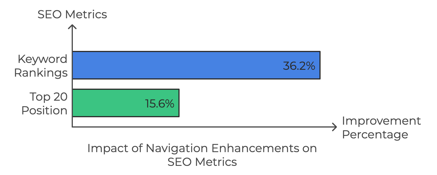
The results speak for themselves. Keyword rankings surged by 36.2%, reaching an all-time high—a testament to how effectively search engines could now crawl and index key pages. But the impact didn’t stop there. Proxibid also climbed into the top 20 search results, marking a 15.6% improvement, another milestone that reinforced the power of strategic navigation in driving organic discovery.
These aren’t just numbers; they’re proof of a transformational shift—one where a seemingly simple navigation change became the catalyst for unparalleled visibility, discoverability, and search engine dominance.
Balancing seo and ux among time constraints
Redesigning the Proxibid website was an exciting yet challenging journey, particularly when it came to aligning our SEO enhancements with the user experience (UX) goals. The most pressing issue we faced was the limited subcategory links in the primary navigation—an obstacle that not only stunted search engine rankings but also made it difficult for users to quickly find the products they were searching for.
As we worked to address this, we encountered the difficult task of expanding the navigation system to include more subcategory links while still maintaining a clean, intuitive user experience. The key challenge? Striking the right balance between providing more options for SEO without overwhelming the user with an overly complex navigation structure.
While we saw significant SEO improvements—most notably a dramatic increase in visibility and keyword rankings—the time constraints of the project didn’t allow for a deeper focus on the information architecture. Ideally, a phased approach to testing could have allowed us to refine the navigation in real-time, ensuring that users wouldn’t be overwhelmed by too many options at once. In hindsight, earlier-stage user testing with prototypes could have helped identify navigation inefficiencies before the full implementation.
Going forward, I see the value of incorporating continuous feedback loops and iterative improvements to not only refine usability but also maximize the SEO impact—turning the lessons learned into a strategy for long-term growth.
Let's Connect
Great connections are made over coffee. Sign up today to have a coffee chat vitural or in person.